What's your next favorite movie? Join our movie community to find out
Image from: Life of Pi (2012)
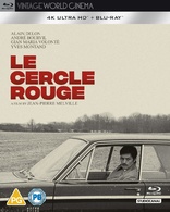
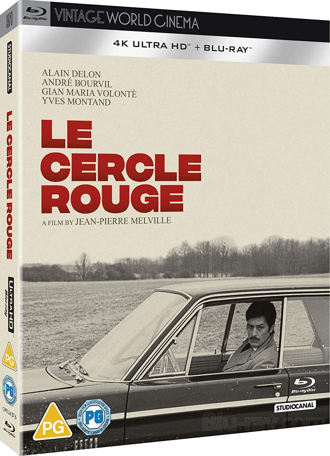
Le Cercle Rouge 4K Blu-ray
Posted October 9, 2020 04:43 PM by
StudioCanal will release on 4K Blu-ray and Blu-ray Jean-Pierre Melville's thriller Le Cercle Rouge (1970), starring Alain Delon, Bourvil, Gian Maria Volontè, Yves Montand, and Paul Crauchet. The two releases will be available for purchase on November 23.
Studio description: Alain Delon, Gian Maria Volonte, and Yves Montand star as the elegant, mis-matched trio, locked in an elaborate and dangerous game of cat-and-mouse with the inscrutable police inspector (ANDRÉ BOURVIL), who is determined to foil their attempts to pull off the perfect crime, despite being drawn irresistibly to his prey. As the day of the heist dawns, the story unfolds, with all four players determined to cheat fate.
Special Features and Technical Specs:
NEW 4K RESTORATION OF THE FILM
The Perfect Circle
Under the Name of Melville
Interview with Bernard Stora
Interview with José Giovanni
Ginette Vincendeau Presentation of Le Cercle Rouge
Optional English, French, and German subtitles for the main feature
The trailer for the 4K restoration suggests that it is another botched job from the French. The entire color scheme is wrong -- Melville's big crime films all had heavy blue(ish)/cold, not yellow(ish)/warm, fonts.
^^ It is a cold blue/grayish font. The entire sequence in the beginning of the film where Volonte is followed and meets Delon takes place during a very cold winter day. This screencapture is from it:
On the trailer, at 0:12, it is plain as day that the new restoration has shifted the sequence to a much warmer temperature. Also check out the dancers in the club:
The person that graded this restoration tried to make Le Cercle Rouge look like the latest restoration of Army of Shadows. This isn't how Le Cercle Rouge is supposed to look.
The trailer looks completely fine. And I think this deference to mildly different prior colour schemes is overrated and overblown - heretical to state here, of course, but I think it's true.
I did an Army Reserve induction course in Melbourne a few decades ago, and the part where they held up coloured images made up of lots of coloured dots - can you see a butterfly, what number is on this card? etc - confirmed for me something I'd had mentioned in high school. There's a shade of either blue or green that I'm totally colourblind to, and what appears mid tone green or blue to others will look darker toned to me. So I'll never see things precisely the way that others do, unless they have the same vision range that I do.
So here we are looking at an uncut, newly 4K transferred, nicely subtitled version of a classic French film from around 50 years ago, and there's angst because the colour on this version is mildly different to what might have appeared elsewhere. Snooze. If Melville was alive today, he'd probably shrug, chuckle, tell folks to enjoy the film, and recommend they go out to a nice restaurant afterwards for a glass of wine to reflect on the themes of his movie with a couple of pals. I'll happily buy this new version. Others can avoid it if they want.
@Anthony Thorne it's a slippery slope, though. If these companies aren't held to some kind of standard in terms of preserving the original colour timing, who knows what buffoonery they'll try and pull in the future. You wouldn't want someone in charge of restoring a classic painting to tweak the original colours, as far as I'm concerned films should be treated the same way.
I will withhold a decision to get the disc until we get some reviews of the final product, but pro-bassoonist is correct. It's been a steely blue and gray movie for 50 years, so it's no time for a new color timing when the director is conveniently not around to correct it. This is unfortunately happening all the time now, with both classics and more recent hits. If it doesn't bother you, fine, but it's just as bad as changing the aspect ratio in the bad old days of video.
@Anthony Thorne: The trailer absolutely does not look "completely fine". If what is on the trailer is representative of what would be on the Blu-ray, the restoration is a botched job. Also, the film has never been "cut", so this won't be a revelatory "uncut" version. Melville's big crime films have a very particular look, and there are 35mm prints that are often screened at retrospectives that prove it. (There are a ton of writings on his style as well).
Thus far, it looks like the new 4K restoration alters the entire vibe of Le Cercle Rouge. It appears that it does so in much the same way the French altered the look/vibe of Jacques Tati's "Play Time". Tati's film, which I have seen in the cinema, always had a cold, silverish look, which gave it a futuristic industrial vibe. The 4K restoration gave it a warm look with the creamy yellowish/greenish hues that you see in the trailer:
I don't form a final opinion simply by looking at screencaptures or trailers, but as of today everything that I have seen points to yet another fumble. I will most likely pick up the release and then comment again.
^^so your definitive version of this film is the Criterion version ?
Did you see this when it was released in the cinema in 1970 ?
Is the Criterion correct color?
I'm watching the Criterion now and it's not cold as ice like you descripe it
My definitive version of which film? Tati's film? I would not describe Criterion's first release of Tati's film as definitive because anyone with half a decent pair of eyes can see that the presentation on it looks dated. It came out more than a decade ago, and the master was prepared even earlier. There are completely different standards now. Also, I did not say that it is supposed to look "cold as ice". However, the color temperature of the old master for Tati's film is absolutely the more accurate one -- the film is supposed to have that industrial silverish/cold look. I saw it many years later.
If you are asking about Melville's film, Le Cercle Rouge, there is more than enough that has been written about his style. This blue(ish)/gray(ish) font -- or whatever you want to call it -- that defines the temperature of his big crime films is essential for his style. It is actually part of the mood of these films.
^^ When did this become a Tati film thread ?
Did you see Le Cercle Rouge in 1970 ?
And why should the Criterion version be the benchmark ?
And what is as font on a movie ?....isn't that text style ?
1. I did not see Le Cercle Rouge in the '70s.
2. I have not addressed Criterion's release of Le Cercle Rouge. If anything, I would pick the old release from Canal, because Criterion are on record admitting that when they prepared the old master -- for the DVD release -- they might have destabilized the blue(ish)/gray(ish) balance by introducing more red hues. This is what I have been trying to clarify so far: Le Cercle Rouge is supposed to have a colder blue(ish)/gray(ish) appearance. This is why I linked the screencapture with Volonte and Delon, which comes from the old Canal release:
3. Font. In the old days, when there were discussions about Melville's films, some people liked to use the term 'font', which addresses the different layers or blues and grays that establish the color scheme. There are a lot of them in Melville's final film, Un Flic, which is the 'bluest' of the bunch:
As an aside, I just watched Cohen's disc of King of Hearts (Le Roi de Coeur) tonight. One of the extras is an interview with the cinematographer Pierre Lhomme. He talks about his work grading the digital transfer, and how the modern colorists he's working with have no idea what the movie should look like (and he also says they don't care). He specifically says that modern technology is so good that it allows the operator to make horrible mistakes since they have no concept of the original look of the movies. One more example that proves the rule.
If you listen to The Deakins podcast, Roger Deakins talks about Melvilles DP having a disagreement with Melville over the color of his films. Melville wanted it one way (I think a grayer/cooler tone). After he passed away they consulted the DP who was then able to adjust the color grading to his liking. Not saying this is the case here, but it may explain the discrepancy youre seeing.
I wont say anything re Criterion. My wallet speaks louder. I have the C blu. Now I will get the Euro Region-Free 4K.
Sorry, couldn't resist but the typo (Alain Deloin instead of Alain Delon) automatically reminded me (and many French-speaking people I guess) of this: https://youtu.be/-wF6n9t5LxQ?t=272
Doesn't make sense. Studio Canal keeps pumping out 4K releases and we are constantly told 4K is dead. Seems counter intuitive to keep releasing 4K if it doesn't sell. Just shows what Criterion is missing.
Moviemaker, I think you got the story Lee Kline told on the Team Deakins podcast wrong. He said that he timed it to match the print they had for reference, then he went to work with Raoul Coutard on something and Coutard pointed out that Kline got it wrong and the colors didn't match what Melville and Henri Decaë intended.
"I'm mildly colorblind so I think it's silly that it matters to you whose sight is not impaired that something cold is presented as warm" is a bizarre argument to make. It bespeaks a lack of imagination and empathy.
Presenting something in a warm tone that was purposely shot in a cold tone is not a restoration, it's revisionism.
In the case of the original DP authorizing the alteration, I find that even more chilling than the idea that people doing these digital transfers have no idea and don't care about what the filmmaker's original intent was. (Why do such people get those jobs?) But neither purposeful nor clueless nor neglectful botching of the artist's intention is acceptable.
This is not unlike "colorized" versions of movies. That any one of us likes one better than the other is fine for any one of us to feel or even to say but it isn't the point when it comes to an official restoration. Yellowed or sepia tones draw a different psychological and emotional response than bluish hues or a straightforward black and white. It's almost like a technician adding jokes to subtitles because they'd rather it had been a comedy. Fine if you're Mystery Science Theater 3000 or Elvira, as a distinct creative manipulation, commentary or parody, but not as a faithful restoration.
I'm all for revisiting images and looking at them in new ways, that has always been the province of the artist (much less the derivative entertainer) but only when it doesn't prevent the original from being properly preserved and presented so the viewer can see the liberties being taken and contemplate the reasons why or note the different effects. And these depictions should not be sold as ostensibly the original, there should be an acknowledgement of what and why and by whom the change has been made.
The goal of any restoration should be getting as close as possible to the auteur's intentions and the original product, to preserve for the historical record the original vision.
")
")
")
")
")
")
")
")
")
")
")
")